Monday, 2 December 2013

Independent Project Proposal- Part B

I will be using illustrator and I may use photoshop if I have time in the end to add shadows and lighting. When everything is done, i'll save it as a jpeg or psd to post it on my blog. Since I just began using AI a few months ago, I know how to do the basics like the pen tool, ellipse, etc and I learned a lot from Roxana so I think I will have no problems when I start my independent project.

For the concept of my project is that I will be rebranding the Korean cosmetics website, W2Beauty. I will be designing a new logo, website, poster, flyer, business card, packaging, application, stationary, letterhead, and other samples that she can give in her orders like a pen, notebook, shirt (maybe a sweater), and a bag. I will be keeping her original colour.

I think that I won't have many problems since I learned a lot from the previous assignments. The thing that I will have a problem is that sometimes when I try to change the font colour, after copying and pasting the code, the colour ends up turning grey. This problem occurred so much in the Amazing Inside Poster and Flyer. When I asked someone what I did wrong, apparently they had the same issue too and thinks thinks its a glitch in Illustrator. To fix this problem, theres not much I could do but continue to try and make it the correct colour.

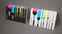
I couldn't find a contemporary artist that does simple and girly designs so I just searched up images that are similar to my idea...

6. Timeline

Day 1: Draw the logo, sweater, shirt, notebook, packaging, and bag then scan it into the computer
Day 2: If not scanned the day before, scan it and trace or use the pen tool
Day 3: Start on the logo
Day 4: Finish
Day 5: Start on the packaging and notebooks
Day 6: Finish
Day 7: Start the shirt/sweater
Day 8: Finish
Day 9: Start the bag
Day 10: Finish
Day 11: Start the flyer
Day 12: Finish
Day 13: Start the letterhead and stationary
Day 14: Finish
Day 15: Start poster
Day 16: Maybe continue
Day 17: Finish
Day 18: Start business card
Day 19: Finish
Day 20: Scan the drawing of the website and app and trace or use the pen tool
Day 21: Continue
Day 22: Finish
Day 23: Complete other stuff

7. Researched images
This is the original logo and design of W2Beauty

Tuesday, 26 November 2013

Visual Identity Poster


Naomi Morimoto Dezain (ナオミ森本デザイ), is a company with a friendly but professional personality.  It creates realistic and manga/anime drawings. 

To design my logo, I used mainly curved lines and organic shapes to give it a more playful feel. The colours in my logo is a light pink turning into black to show that I can do both girly and playful and serious work. The logo is balanced well since the 'N' and the 'M' take up an equal amount of space while the tails of the letters go in opposite directions with the same proportions of circles spiraling out. I added the circles to give my logo more of a shape rather than leaving it as an 'NM'. There is contrast between the 'N' and 'M' since one's a pale pink while the other is black. I see more emphasis on the right side due to the black but I think that since there's a range of pinks that it balances out.

To create the business card, flyer, stationary, and letterhead, I used a gradient background to give them all unity. In the business card and flyer, I added anime pictures in my logo to show examples of what my company does. I wanted to have a realistic picture on the 'M' but Illustrator wasn't able to trace my scan so I had to use another anime drawing. For the stationary, I added a lace design because I was thinking ahead and wanted to create a cap with that on the bottom. 

For the additional marketing pieces, I chose to make a sweater and cap because I thought that my logo would look well as apparel. I think they would be cute enough to attract young girls' attention and they would find out about my company. They would also be advertising ナオミ森本デザイ whenever they wear the apparel o(`ω´ )o

Saturday, 23 November 2013

Weekly Blog Post #9

Tips & Tricks: How To Make Water Drops On Photoshop

While I was on YouTube, I decided to search up tutorials and came across a video that shows how to create water droplets on Photoshop, I think CS5 (?). I like chose this video because it shows step by step and it looks simple enough for a newbie like me to do.

I know it might be strange how I'm posting a few Photoshop tutorials when I haven't even tired that software yet but once I have no CyberARTS Tech assignments to work on, I plan to try these tutorials out.

How to Make Water Droplets on Photoshop CS5: http://www.youtube.com/watch?v=YyothXgOR0Y

Weekly Blog Post #8

Artistic Inspiration: Zhang Jingna ( 張晶娜 )

Zhang Jingna is one of the more recent photographers since she started her first photography career in 2008 at the age of eighteen. In the same year, she photographed for companies such as Mercedes Benz, Canon, Pond's, Ogilvy & Mather Advertising, and Wacom and produced fashion editorials for magazines such as Harper's Bazaar, Elle, and Flare and also held her first solo exhibition, "Something Beautiful" at The Arts House in Singapore. 

Two years later, fifty of her works were showcased in the Singapore's fashion festival; Singapore's first large scale street exhibition featuring fashion photography. Right after this exhibition, she had her second gallery show, "Angel of Dreams" at the Japan Creative Centre which is supported by the Embassy of Japan. The show was noted for her photographs of Sugizo, a Japanese musician.

Jingna is an inspiration to me when it comes to photography because I was really amazed by her first photographs she took with her first camera. Even though she didn't have much to work with at the time, her first pictures still made me go, "How??". At the time, most of her pictures were self-portraits but I was shocked that even though she was a rookie, her pictures looked like they can be in fashion magazines or art galleries.

 Her photos she took in the next two years just amazed me even more. I don't even know how she came up with those photos when she didn't have that many years of experience. In 2007, she experimented with fashion, beauty, movement, gothic Lolita, etc. For the photos she took that year, I liked how they were dark and contrasting, which drew attention to the model. 2008 was when she took the first pictures I saw of hers. That was the year she went on her trip to Japan and started exploring studio photography, shot commercially for companies like Mercedes Benz and Harper's Bazaar, and published her first photobook. I still don't understand how in two years after picking up your first camera, you can have well-known companies like Mercedes Benz wanting you to photograph for their advertisements. 

I admire Zhang Jingna because she accomplished so much in her first years after picking up her first camera and she is still very young. I remember for my photography culminating in grade 11, we had to choose a photographer and copy their style and I chose her but I know I failed in trying to replicate her photos because I was still basic at the time with a DSLR camera. She makes me want to practice more with DSLR cameras and try experimenting with movement and beauty. 

DeviantART: http://zemotion.deviantart.com/


Independent Project Proposal- Part A

For the individual tech project, I was thinking about making an animation but the problem is that I don't think I am able to learn and create one in time which I would be completely satisfied with. I am even still a newbie with After Effects. I attempted to make an animated version of my logo but it is very simple and when I uploaded it here, it went from 4-5 seconds to 10 seconds so everything got slowed down. Why me? 

So I dropped that idea and decided to brand W2Beauty, a Korean cosmetic website because after finishing up the visual identity unit, I realized that I actually enjoyed it. I got to be creative and design my own business card, flyer, stationary, apparel, etc and this will allow me to learn more about Illustrator and I might experiment with Photoshop for the first time.

Similar to the Brand Identity assignment, I plan to change her logo and make a flyer, business card, stationary, and letterhead but I also want to design a website, packaging, application, and other freebies that she can give in her customer's orders like a pen, notebook, shirt, and bag. If I have plenty of time before the due date, I want to make many versions of those freebies.

Sunday, 17 November 2013

Zelo ( 젤로 )


This is one of the sketchbook assignments for CyberARTS Visual. This one was for 'Create a political cartoon of someone recognizably famous. Use black ink and remember to exaggerate or distort the image to make it 'cartoony''.
 
The celebrity I chose to do this on is someone a lot of people on this side of the world wouldn't know since he's from a Korean hip hop boyband named B.A.P (Best Absolute Perfect). I chose to draw Zelo from B.A.P's Stop It music video because its a unique outfit that can be easily recognized by whoever has watched this video.
 
Before I started drawing, I watched the music video and the making of to screen shot his outfit. I then went through my iPad's pictures to find a pose of him that I wanted to draw and for the background, I screenshotted B.A.P's logo, which is of an alien bunny. Don't judge them. Bunnies are adorable and Zelo is a baby bunny!...don't judge me either.

Amazing Inside Poster & Flyer


For the Amazing Inside poster, I wanted to make the blue square with the circle the focal point since LCI has that in the front of the school and logo. Since our moto is "Amazing Inside", I wanted to have the unique courses that our school offers coming out of the circle. I wanted my poster to show the viewers that LCI is a school of excellence.

Everything is done in simple geometic shapes since I didn't have time to add value into the objects on photoshop. I made the background a black gradient because I wanted the other things to pop out. After looking at the final product, I think my poster would have been better balanced if I lowered the blue square/circle a bit and making "LCI's Open House" look interesting than leaving it plain.

The symbols I used in my poster was a car to represent Auto, the girl getting dolled up to represent Cosmetology, the power drill to represent WoodLINKS, the computer to represent CyberARTS Tech, and the paint brush and pallet to represent CyberARTS Visual. 

I am definitely not satisfied with the final product. I still wish that our teacher didn't make this mandatory for the year fours since we had a lot to do for the visual identity assignment. The week I made this was stressful ( ̄^ ̄)ゞThe ONLY thing I am kind of satisfied of is the car. That took me a while to make. 

If I had more time, I would've made my own background (still using different values of black), I would've added other subjects that LCI offers to add more colour and make the poster look interesting, and I would've made the font complex than very simple. 

Ugh I'm still mad about the font in the computer. I wanted to make the font the same orange that's in the logo so I copied the colour's code and pasted it but when I clicked apply (or something like that), it turned to grey and not orange! I kept trying and trying but it gave me the same results. I was so confused because it worked for some of the other words (*`へ´*) I asked Roxana for help and she also had the same problem and thinks it may be a glitch in Illustrator.

When it came time for the flyer, I wanted the images I made in the poster to be in there too so when I made it smaller, the image became messed up! I was like "WHY DO YOU HATE ME?!" and started thinking that I have to create the images AGAIN until Roxi came to the rescue again and showed me how to change the size without it becoming messed up in the end. I had to flatten the transparency and group the image. This allowed me to finish my flyers more quicker. 

Sunday, 10 November 2013

Weekly Blog Post #7

Wild Card: Hatsune Miku Speed Paint

Hatsune Miku (初音ミク) is a 16 year old Japanese humanoid persona with long turquoise pigtails and is voiced by a singing synthesizer application developed by Crypton Future Media.  Her name is meant to signify the "first sound from the future".

I found out about her when I went to the Fan Expo and saw a few girls cosplaying as her. The long turquoise hair caught my eye since I like long hair (^ν^)At first, I thought she was a manga or anime character and asked the workers of a manga booth if they had her manga. They searched and said that they don't. When I got back home, I searched her up online and found out that she's actually a humanoid created by nerds (°_°)

Remember my earlier post about "How To Draw Manga On Photoshop"? Well I started watching speed paintings again and this one stood out more than the others for me. The creator made it look like red lights were shining on her and added warmth to the picture.

Speed Paint Hatsune Mikuhttp://m.youtube.com/watch?v=480FLNMUpUk

Weekly Blog Post #6

Tips & Tricks: Creating Light Rays in Photoshop CS6

Due to my aunt moving into a new house in Brampton, Im always going back and forth from Toronto and Mississauga to Brampton. It's about a 30-40 minute drive to the new house and I see a lot of landscape. She keeps on telling me to take pictures of the trees and wants me to paint it. The most recent thing she told me to paint was the sun's rays peeking out through the dark clouds.

That's when I got the idea to try to make sun rays in a manga drawing. After I scan my own drawing and put colour and value into it, I will try this tutorial that I watched on YouTube. I liked this tutorial because it looked simple enough for me, a newbie in photoshop, to accomplish.

How To Create Light Rays In CS6: http://m.youtube.com/watch?v=1xCtXPcky54


Weekly Blog Post #5

Tips & Tricks: How To Vignette In Photoshop CS5

When I took photography in grade 11 we had to take pictures in the studio for our culminating. We had to set up the lights and camera settings yourself and then photoshop 3 of the photos. We had to dodge & burn one, diffuse & soften a different one, and vignette another.

A lot of students including myself had a difficult time using vignette. Even the teacher forgot how to do it and searched up tutorials on YouTube. The videos he searched up was no help but when Roxana came into my class, she played around and somehow succeeded.

I found a tutorial that made vignetting more simple compared to the way I did mine last year.

How To Vignette In Photoshop CS5: http://m.youtube.com/watch?v=9KmiTXxlxtM

Monday, 4 November 2013

Visual Identity: Logo

ナオミ森本デザイ


The name of my company is Naomi Morimoto Dezain (ナオミ森本デザイ), "dezain" meaning "designs" in Japanese. I decided to go with the Japanese word to make it stand out more than leaving it as the word design and since I specialize more in manga and anime drawings, I want to attract more of those clients. I also want to work in Japan someday.

I want to make my company have a friendly but serious feel. I am friendly in person but become really serious when it comes to work.
For the elements and principles of design, I used mainly curved lines and organic shapes to give it a more playful feel. The colours in my logo is a light pink turning into black to show that I can do both girly and playful and professional and serious work. The logo is balanced well since the 'N' and the 'M' take up an equal amount of space while the tails of the letters go in opposite directions with the same proportions of circles spiraling out. The circles just gave my logo more of a shape rather than leaving it as an 'NM'. There is a contrast between the 'N' and 'M' since one's a pale pink while the other is black. I see more emphasis on the right side due to the black but I think that since there's a range of pinks that it balances out.

While sketching out ideas for my logo, I had my bunny idea turned down (don't judge me) and moved onto a different idea where I just have my initials. I made many different versions and it slowly became to this. I added the circles to make it more recognizable and different.

To create my logo, I scanned in an inked outline and used to pen tool to make the 'N' and 'M'. I used the ellipse tool to make the circles for one end and copied each one so both sides would be the same proportions. I then chose my logo colours and filled in the 'N' and 'M' and the largest circles. For the other circles, I went to the same pink and chose colours that eventually go to black. I had a difficult time using the pen tool since I had a hard time getting the curves perfect. I got upset when I couldn't get the circles perfectly round but I was lucky that Alfonso was there and showed me how to use the ellipse tool. That made my life so much easier. Thank you Alfonso ^^

Hmm...I really like my logo design, it's just that I wish I can redo the pen tool to make it look more professional. And today, Tristan gave me helpful advice where I make the 'M's tail more rounded to match with the 'N'. So I am not satisfied with my logo. I may have to wait until I finish all the things left to do for the Branding assignment since it would take me some time to make the logo to my satisfaction. I'm worried that I lost marks for saying I'm not happy with my logo but at least I'm telling the truth. ( ̄3 ̄)

For the two other visuals, I want to make an apparel and have ideas already sketched out. I am not exactly sure what I want to do for the second but maybe my packaging designs, like how each size box would look to ship my artwork to the client, or maybe a magazine advertisement? I am not 100% sure yet since I still have a few other things to do, like the animation... For the animation I plan to have the 'N' and 'M' come from opposite ends and connect at the center then have the circles popping out in order from the tails of both letters. Sorry if I didn't explain it well 。・°°・(>_<)・°°・。

I have the flyer and business cards done. It's just that I am working on getting my drawings in each letter. The 'N' with my animated drawing of B.A.P's Zelo is finished, I just have to do the same with the 'M' but with one of my realistic drawings.

Wow that took WAAAAY longer to write than I thought it was gonna be O__o
(Felt like I wrote an essay)

Sunday, 3 November 2013

Weekly Blog Post #4

Artistic Inspiration: Hayao Miyazaki (駿宮崎)


My favourite director is Hayao Miyazaki (駿宮崎) who is best known for his film, Spirited Away. It is an animated surreal movie about a young girl who is forced to survive in a spirit world and works in a bathhouse after her parents get turned into pigs by the witch who owns it.

The first time I watched it was in middle school. We were watching it during class and I was so mesmerized, I couldn't take my eyes off the screen. But class ended before the movie did so I made my parents take me to Future Shop to go buy it. After that, I started watching his other films and got inspired to become an animator and create movies like his.

Here is the link to the trailer for Spirited Away: https://www.google.ca/url?sa=t&rct=j&q=spirited+away&source=web&cd=20&ved=0CLwBELcCMBM&url=http%3A%2F%2Fwww.youtube.com%2Fwatch%3Fv%3D6az9wGfeSgM&ei=gwt3Uub-IYeQ2gWC7ICoBA&usg=AFQjCNFPVQaW5sjNnZTyyT6rawEZtEMcog&sig2=jPYZmJ4ELWL9Kde_eQsm6g&bvm=bv.55819444,d.b2I

Weekly Blog Post #3

Tips & Tricks: How To Draw Manga On Photoshop


Ever since I started drawing manga in grade 8, I admired the drawings done on photoshop. I would enjoy watching speed drawing videos because I found it amazing to see a simple sketch come to life and made me want to learn and make one someday.
If you want to learn this also, click on the link~

How To Draw Manga: http://www.howtodrawmanga.com/pages/tutorial-photoshop

Saturday, 19 October 2013

Weekly Blog Post #2

Artistic Inspiration: Matsuri Hino (祭り日の)


Matsuri Hino is a Japanese author and illustrator best known for her world-wide popular manga series, Vampire Knight. It is a graphic novel series that she started in 2007 and just finished it this year.Unlike most mangakas (manga authors) who have assisstants to draw their architecture and scenery, Matsuri does it all herself.

She has been a big inspiration to me ever since I started reading manga in grade 6 and the reason why I started drawing it. I loved the way how Vampire Knight wasn't like the other feminine ones where the girl falls in love with the guy and they live happily ever after but instead it has action, mystery and leaves you in suspense for the next chapter. I admire everything about her from her stories to her drawings and wish to be able to draw like her.
Btw, if you are a graphic novel reader and you didn't read Vampire Knight yet...CLICK ON THE LINK BELOW.

http://mangafox.me/manga/vampire_knight/


Weekly Blog Post #1

Artistic Inspiration: Lotten R


 One of the artists that is a big inspiration to me is Lotten R. I am not sure if Lotten is her birth name but that's what she goes by on her DeviantArt account.

Late last semester, a friend showed me a drawing this person drew and I assumed that she was lying because it just looked so realistic! It was a drawing of a member of a Korean boyband called Infinite. The more my friend would show me the drawings, the more I would get sad. I thought those hand drawings were amazing until I saw her computer drawings. I. Was. Mind. Blown (And even more sad).

Lotten mainly uses a simple lead pencil and a stomp to make her drawings but uses Photoshop CS5 and a Wacom Bamboo fun pen & touch tablet to create her computer drawings.

At the time, I was beginning to do realistic drawings and I thought they were great but now I am determined to be able to make art like her someday.

DeviantArt: 
http://lott-lott.deviantart.com/
Tumblr:       http://lotten-art.tumblr.com/
YouTUBE:  http://m.youtube.com/user/WhereDoMyBluebirdFly?&desktop_uri=%2Fuser%2FWhereDoMyBluebirdFly

Take a look at a few of her art while I go into a little corner and cry...


Monday, 30 September 2013

Infograph: Animator


The concept was to create an information graphic that visually describes my career choice options related to CyberARTS tech. Since I want to be an animator, I drew Tokidoki characters and made a "Chibi" version of myself.
 
My goal was to make it Tokidoki themed so I used contour lines, no formed shapes, no value, and put lots of colour. 
 
I want to go into the animation world because I am really interested in animation movies due to the surrealism and fantasy. 
 
My information graphic was done by scanning my drawing of the outline and using Illustrator to put in the colour and words. While making this, I tried using the tablet but mostly drew with the mouse. I would've liked to tried experimenting with Photoshop but I wanted to keep this infographic simple.
 
I am quite satisfied with my work since this was my first time using Illustrator and drawing on the computer. There wasn't really any infograph that inspired me since the examples I saw looked complex. If I could redo this again, I would change the entire thing now that I am more confident now with using Illustrator.